Are you involved in digital marketing activities? Then probably you know that building the right Landing Page on your website is an empirical challenge for both paid and SEO campaigns.
If you are curious about how you build better Landing Pages, how many types are used in eCommerce and which is the best practice, read this article. In the end, you should also be able to form a new custom template that fits better your brand or market niche.

What is a Landing Page?
A Landing Page (LP) is the area of interaction with the public between the Top of the Funnel and the purpose of the eCommerce campaign, i.e. conversions. It is a website page specially created for an advertising campaign, with a well-defined purpose. A visitor accesses this page if it’s redirected via a link she/he clicks. This referral link is called Call to Action (CTA link).
There are many options to build referral links. The most used are the following:
- Social media ads or posts
- Search Engine Marketing Ads (PPC platforms like Google Ads)
- Organic traffic (internal referrals)
- Emails
- Banners or CMP campaigns
- Referral websites (e.g. affiliated marketing, marketplaces, influencers).
A Landing Page is a key part of a digital marketing campaign and it works by using call-to-action (CTA) fields (links, buttons, forms).
Its main purpose
The main goal of a Landing Page is to deliver conversions and short term revenue.
Why would people visit a Landing Page?
There are many reasons why people get to visit a landing page. To narrow the reasons, from the AIDA model point of view, users access Landing Pages only after they become aware of the need and start showing interest in a brand or its category.
Here are a few real-life scenarios when a user accesses this type of page:
- A user looks for details about the product promoted in the advertisement
- When searching for a sales deal
- Is interested in filling out a form
- Registers for an event
- After an interaction with your website’s chatbot
- When trying to reach the call-centre
- After receiving an email to access a time-limited offer or content
Where is located a Landing Page in the Marketing Funnel?
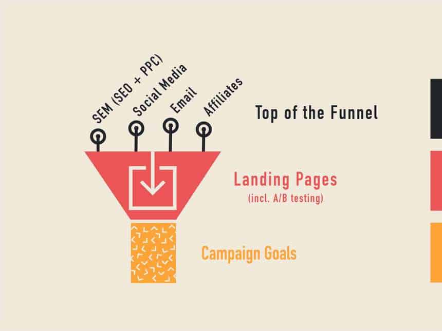
It is is placed at the Top of the Funnel in the channels where people are captured – Email, Social Media (Facebook, Instagram, Google, Pinterest, Reddit, Tik-Tok), Affiliated Marketing, Search Engine Marketing (SEO+PPC). On these referrers, the users must click a link in order to reach the Landing Page, where they will perform certain actions based on the purpose of the marketing campaign to complete a conversion.

Why is it important to create a landing page?
The Landing Page is a marketing channel that helps you turn visitors into potential customers. It is an effective way to get qualified leads and sell your products or services, raise awareness or educate a certain segment of your target audience. These pages are an effective way for your team to get to good prospects and to give them reasons to become your customers.
The most common goals
The main goals for a landing page can be to increase consumer loyalty and increasing profit with a long-term goal ahead.
The most important task for you is to benchmark your goals for that Landing Page, expressed in the number of leads or revenue. For example, a goal could be: receive 1,000 appointments to present your product at the customer’s location.
How to choose a model for your Landing Page
It is recommended that you do not reinvent the wheel and use models of Landing Pages that already showed proof of success. In this respect, you need to study eCommerce literature, to track your previous eCommerce campaigns, but also to get inspiration from your competitors or other industries.
Second of all, make the best use of User Experience (UX) and Sales techniques that you know and do not compromise on what the landing page should contain. If you are aware of UX trends in eCommerce, you will have better conversion rates (CR) and more successful campaigns. Moreover, you will help the visitors with the right information, having them satisfied with the content received.
The two types of Landing Pages
You’re probably wondering: “How many types are there? Because I can’t tell the difference between them, and how they would fit my niche”. Well, things aren’t that complicated, as we have two types of Landing Pages:
- Lead Generation Landing Pages or Lead Capture Pages. Usually, they include a call-to-action in a form that needs to be filled out by the visitors and they collect visitor persona data in order to build a database of potential consumers. For this type to work, many marketers offer freebies: ebooks, infographics, insights, discounts etcetera.
- Click-through Landing Pages, that are preferred by SaaS (software-as-a-service) and eCommerce. Most often they advertise their product portfolio from the start as a trial and the CTA is a simple button that sends the users to the payment page.
What is the difference between homepage and landing page?
A homepage is the cover page of a website, the main page that links to the other sites of the website. It features a menu, CTA buttons, different sections, header and footer. On the other hand, a Landing Page has no menu, it does not let the visitor get into other topics, sections, products, than the one promoted, the one targeted by the campaign.
How to structure a landing page
When the team creates the design, does the copywriting and builds the conversion mechanism behind the Landing Page, there are 5 key elements to be taken into account. Each one will build the page based on the identified Buyer Persona, the typical adoption process in the respective category and has to be original.
A classic example of a Landing Page template
1. Above-the-Fold content
This first section is what the visitor sees for the first time when accessing the link. It helps you to attract her/his attention, to make her/him stay until she/he reaches the money-making area of the landing page. Keep in mind it must be attractive (make the best use of visuals, headlines and animations), simple to use (think structure, speed) and highly convincing (strong CTA arguments).
The critical first 3 seconds
The attention span of a user is today less than 6 seconds, so just as you skip or let some YouTube video ads play, you need to think your above the fold content as the first 3 critical seconds on YouTube.
The Above-the-Fold consists of 4 sections:
- Main Headline
- Sub-headline
- Hero image, video or animation
- Benefits
The main headline is created to increase the website visitors’ interest. Understand in advance the target audience, try to speak their language, be very concise with what they can find in the LP and how you can solve their need. You cannot transmit all the information about the offer or the brand in your main headline, so you have to try to draw attention and raise interest.
Additionally, the headline gives visitors an impulse to buy through the Sub-headline (also called Support Headline), which details in up to 10 words the WIIFM (“What’s in it for me?”).
As not everyone is attracted to sentences, we also need visuals, so here comes Hero Image, video or animation, a component that increases the brand trust and presents the offer in 60 to 120 seconds.
In the Benefits section, you make people want to go further, to read the whole page. Develop what you receive from the brand and encourage them to fill out the form or find out more in other sections.
2. The Call To Action (CTA) items
CTA is the section where you tell visitors what action to perform on the landing page, what action to take and where to press. Be careful not to confuse them and avoid conflicting CTAs on the same screen.
Apply a “reduction” process for CTAs at the beginning by using tools like Hotjar or Microsoft Clarity.
When you have 3 buttons, people don’t know which one to press and I don’t think you only want to access the free part of the LP. Consider the goal of the campaign.
3. Present a clear set of benefits
Talk about the brand in ways that matter to the audience, not just praise yourself. Think of your users first, as not all people look first at product specs or features, nor they care about how many hours you invested in developing the product. Consumers mainly want to know how your product or services improves their lives.
Depending on the legislation, you can have a specific or generic comparison of benefits versus competitive brands. This will make your offer stand out and increase the conversion rate.
4. Show verifiable social proof
Marketing is overwhelming so people are trying always to avoid marketing materials, mainly because they want to have an ads-free digital experience or because they don’t really trust the brand or company.
Here testimonials can help a lot to show social proof, build legitimacy for the brand. Try to collect them only from users who have tried the product/services. Because testimonials can also be fake, try to use a trustful source such as TrustPilot.
What does trustworthy social proof look like?
Most often it includes details about the user that shares the review (location, job, name, all verifiable), pictures with the product, unboxing videos and video testimonials.
5. Closing argument
Interested visitors reach this final section naturally. If you manage it, then you have better chances to make improve conversions. Here you can add a CTA in case the users intend to procrastinate the buying decision, so you could summarize the Landing Page.
This is your last chance to get them to sign up for the form, click download, buy, click.
Test, retest and improve the landing page
As I mentioned at the beginning of this article, building a Landing Page is an empirical process. For this reason, my recommendation is to test your pages continuously, because user intent is sometimes hard to decipher, especially for new products or services. At the same time, competition may work against you, capturing your leads through ad campaigns.
A/B Testing
A test & improve strategy is needed, alongside agile project adjustments. Try different design concepts, A/B testing, persuasive headlines, attractive colours and CTA.
Even fantastic pages can have better versions, so try to use A/B testing or Multi-armed bandits or Google Optimize (including 360 version) techniques to find alternatives. Assess the results by comparing the versions by measuring bounce rate, visits, conversion rates and revenue. Draw conclusions from the data collected and note the results. You can test how many options you find attractive to audiences.
References: